
KARI ESPORTS
Role
UX/UI Design
Research Strategy
Platform
Desktop
Category
Gaming, eSports
The Problem 🤔
KariEsports needs a way to present their org so they can secure sponsorships, keep users updated, and spotlight marginalized gamers while expanding their reach.
Conducting Research 💡
Our team identified two distinct user groups to gather insight from — First, people who watch eSports and participate in online gaming communities. Second, people who are partnership or sponsorship managers in the eSports and gaming space.
These were our key takeaways:
Sources: User Interviews, User Surveys, Competitive Analysis, User Personas
😒 No more neon color palettes
Users are exhausted with this repetitive meta of over-the-top, hyper masculine, neon web design in eSports.
🎮 Community is essential
Applications like Discord are rewarding to our users, because it enables them to connect to a network of people who share their hobbies.
💰 Visual cohesion can bring in the moola
When looking for potential partners, sponsorship managers assess the consistency in brand design, to see if an org is committed to its online presentation.
📈 Engagement matters
While followers do matter, the effectiveness of engagement through comments, likes, etc matters the most to scouts, when recruiting new sponsorship partners.
Research



Creat
Ideation
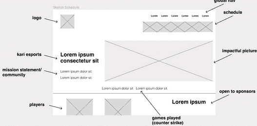
Evolving from sketches to wireframes ✏️ — The key is simplicity + personality
Balancing the negative space with the elements we added to the design was our way of conquering Kari's goal for a minimalist interface. This also delivered our users a sleek, streamlined website that stood out from the org's competitors.
You can never go wrong with fur babies! 🐶
Our team approached the goal of expanding Kari eSports' community by adding a pet photo gallery! One of the most exciting and delightful elements we implemented, in order to add a personal touch that recieved a whirlwind of positive feedback.
High Fidelity ✨


2022
How'd we do? 🧪
We didn't expect to get it right on the first try. In order to iterate on the design of our wireframes, we thought it best to test our early stage design, just to see how users interacted with it so far. (And boy, are we glad that we did.)
The Solution 💡
Build KariEsports a high fidelity prototype that is aligned with their mission and goals to build trust with users, attract sponsors, and grow their online community.


Staff Page Navigation 🪪
Issue
Users had issues locating the Staff button because it did not visually stand out beside the title font.
The Fix
Through iteration, we made the button more immediately apparent that it's interact-able by adding a purple box behind it that highlights what page the user is currently on.

Live Score 🎮
Issue
We received feedback that the font of the event title was a little too hard to read with the bold weight and white text color.
The Fix
We addressed this by reducing the weight of the font and upgraded the text color to a gradient of brand's colors. This not only improved legibility for the Event Title, but additionally increased the cohesiveness of the interface's visual design.

Contact Page 📱
Issue
Originally, the only place to find the newsletter subscription CTA was in the footer. However, we learned through testing that users actually expected to see it on the Contact page.
The Fix
Not only did we implement that change, we additionally added more information to once again meet user and brand goals.
Adding fun pictures of the players to show off the brand's personality and fun-loving demeanor. Additionally, we included a CTA to join Kari eSports, so it was clear the org was looking to expand its staff. We also included easily accessible contact information for potential partnership managers to find.
Usability Testing
Research
Ideation
Usability Testing
Directory
(Click to skip a section)
Next Steps
The future of Kari eSports 🔍
Profile feature for users to allow them to keep up with certain teams per game within Kari eSports, save preferences for merch sizes and also offer notifications about updates on the org itself.
Creating dark and light modes to increase accessibility and cater to user preferences.
Responsive mobile design


Subtitle
Link
Link
Link
Subtitle
Link
Link
Link
Subtitle
Link
Link
Link